Original: $8.09
-65%$8.09
$2.83The Story
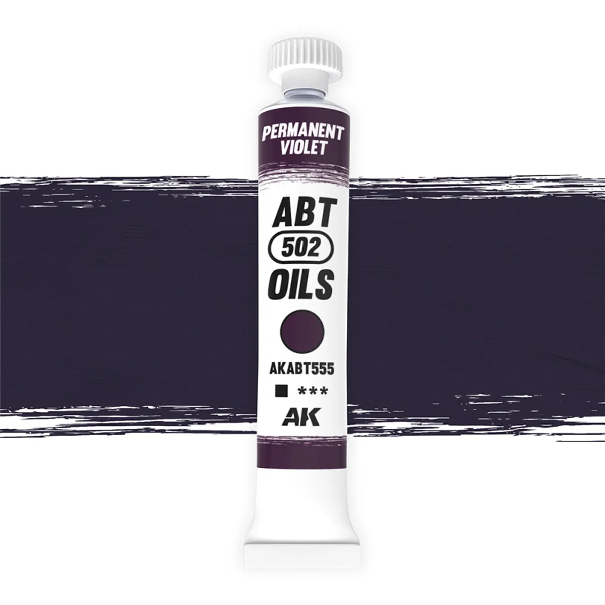
Permanent Violet packs a real punch. It's a saturated tone that adds life and strength wherever you lay it, coming into its own worked over blue, turquoise or violet bases. Cut it with a little white and it softens into a gentle undertone for subtle degradation, so it swings from bold statement to whisper-quiet shading depending on how you handle it.
At a glance
- Abteilung 502 artist oil paint (reference AKABT555)
- Low-oil formula for a more matte, controllable finish
- Ultra-fine, high-density pigments (PV23, PR122)
- Long working time for blending filters, washes, streaks and fades
Best for
- Working over blue, turquoise and violet bases
- Adding saturated life and strength to figures
- Softening with white for subtle degradation
- Rich shadow tones in the cool part of the spectrum
A confident colour that rewards a careful hand — build it up in glazes and it does striking things to a cool scheme.
A saturated violet with real presence. Pairs naturally with the rest of the Abteilung 502 oil range.
Details & Craftsmanship
Every detail has been carefully considered to bring you the perfect product.
Description
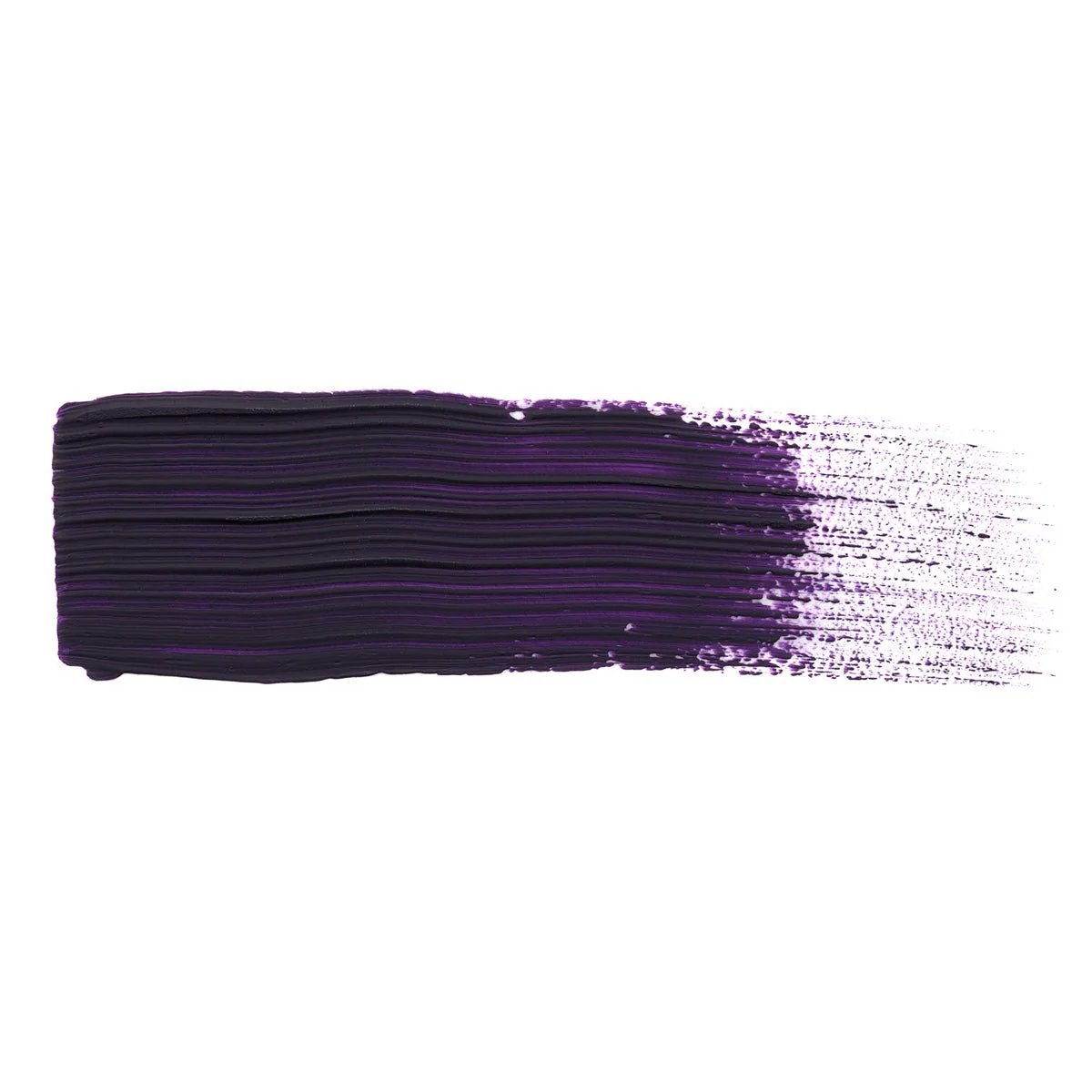
Permanent Violet packs a real punch. It's a saturated tone that adds life and strength wherever you lay it, coming into its own worked over blue, turquoise or violet bases. Cut it with a little white and it softens into a gentle undertone for subtle degradation, so it swings from bold statement to whisper-quiet shading depending on how you handle it.
At a glance
- Abteilung 502 artist oil paint (reference AKABT555)
- Low-oil formula for a more matte, controllable finish
- Ultra-fine, high-density pigments (PV23, PR122)
- Long working time for blending filters, washes, streaks and fades
Best for
- Working over blue, turquoise and violet bases
- Adding saturated life and strength to figures
- Softening with white for subtle degradation
- Rich shadow tones in the cool part of the spectrum
A confident colour that rewards a careful hand — build it up in glazes and it does striking things to a cool scheme.
A saturated violet with real presence. Pairs naturally with the rest of the Abteilung 502 oil range.